Designing with Colour: A Nielsen House Perspective
At Nielsen House, our signature style features lots of earthy tones amongst a neutral colour palette. Perfect for a lakeside getaway, or a stunning family home. Despite our finished rooms looking calm and serene against breath-taking landscapes, there is a lot of thought that goes into choosing the perfect colours for each project. Here are some of the things our designers consider.
Inspiration from Surroundings
Something our designers give thought to when planning colour schemes is the natural surroundings of the property. Nature can be used to a designer’s advantage, whether it’s lakeside or neighbouring some woodlands there are always gorgeous colours to take inspiration from.
Here’s an example of how our designers have taken the watery blue tones from the view of the lake to create a serene blend of colour into this neutral living space.

Using the view from the window helps the colours used appear more natural and visually appealing in the room, subtle touches of colour are perfect for creating a cosy living space ideal for everyday comfort.
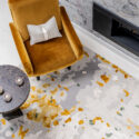
Being able to clearly see the landscape surrounding the home is always an amazing opportunity for our designers, here’s another gorgeous room where the window view only accentuates the notes of yellow hues spread throughout.
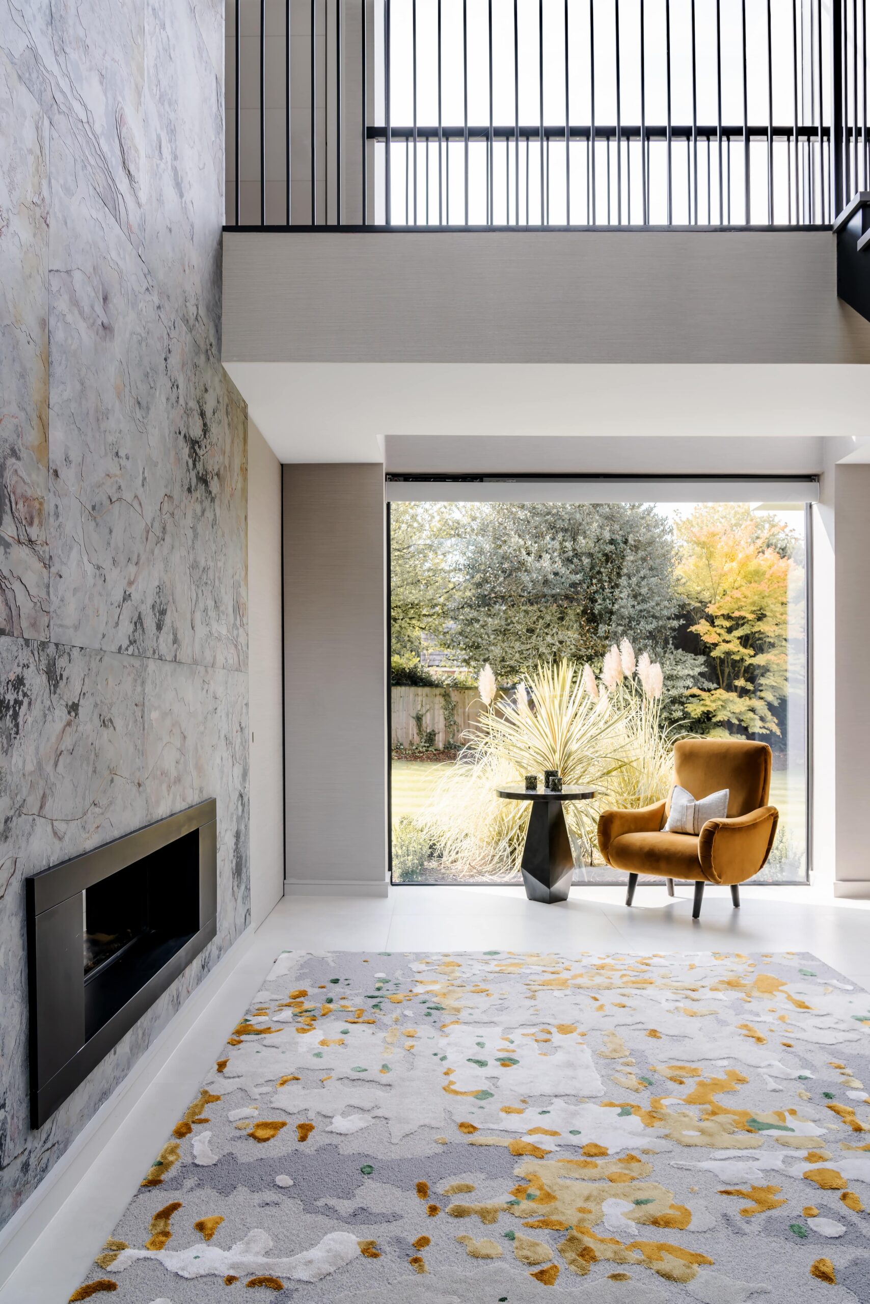
Yellow can potentially be an overpowering colour, which is why it’s not a common occurrence for our signature brand. However earthy tones are something Nielsen House do best, and so our designers decided on these subtle mustard hues because they harmonise seamlessly with the nature outside.
Taking inspiration from nature and our projects’ surroundings is very ‘on brand’ for Nielsen House. We love using natures hues that accentuates the overall feel of the home we’re creating. As well as it being our own signature touch, it’s also something very personal for our clients. Using their surroundings can feel very special, something completely unique to their home!
Usage of Naturally Sourced Materials
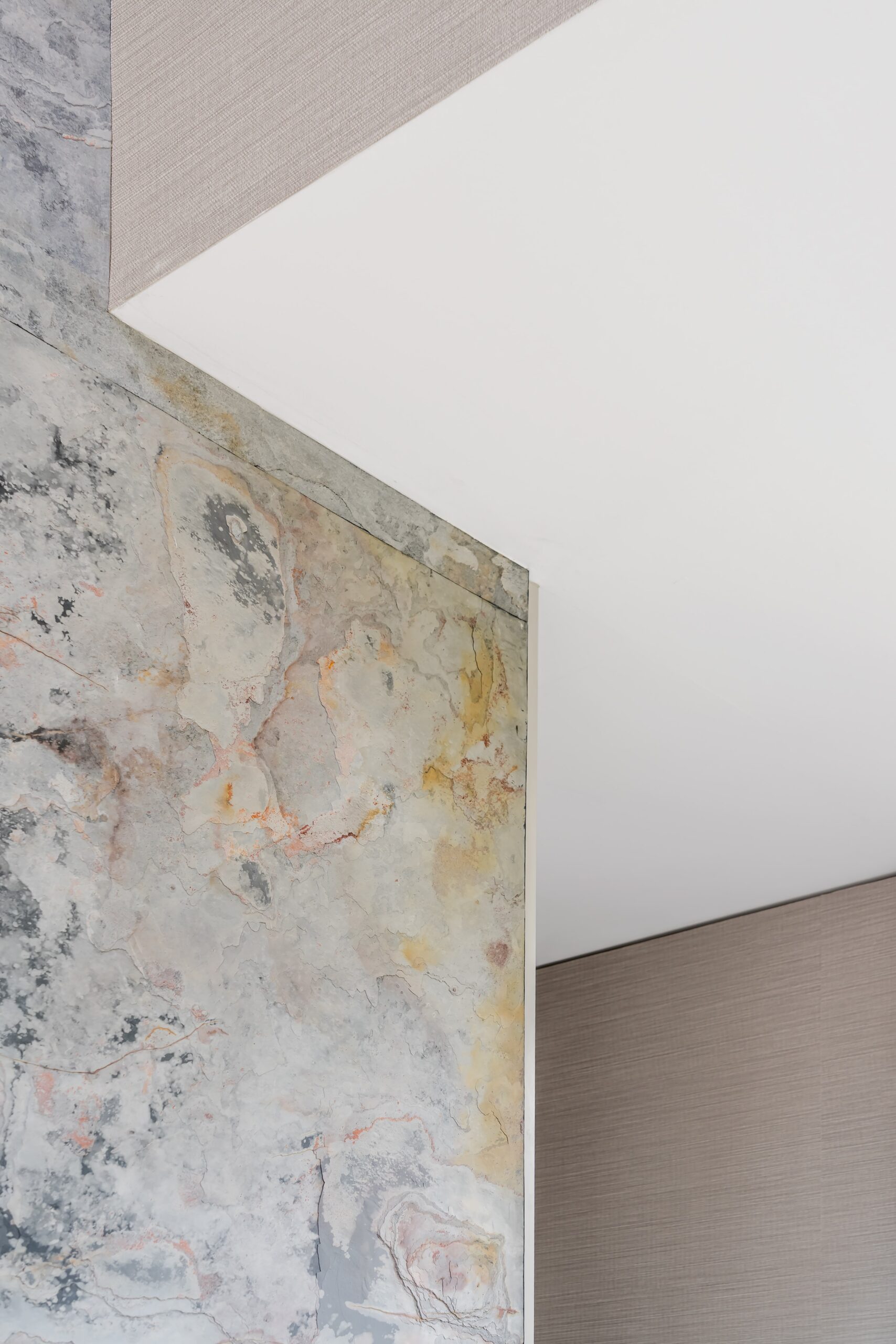
Keeping with the signature theme of using nature as our biggest inspiration, something else we love using at Nielsen House is naturally sourced materials and pieces. Materials like these are often completely one of a kind, which is a lovely addition to an already unique home. As well as each naturally sourced piece being different, they can also display beautiful colours our designers can extract and enhance throughout the rest of the scheme.
The mustard notes from the previous image were also inspired by this stone walling. The natural gold hue bleeds through the entirety of the wall, which our designers decided to accentuate by adding further complimentary accent pieces (i.e. the arm chair, the rug)

The golden hues also add a warmth to the room, creating a comfortable atmosphere amongst the overall cooler neutral tones. Perfect for an evening reading by the fireplace.
An Artist’s Touch
Art is a creative way to bring in brightness to a room. Our designers love using adventurous pieces that stand out amongst a room without looking out of place within the overall colour scheme.
Most of the artwork our designers pick out are from local artists around the Lake District. Here’s a Libby Edmondson piece that looks stunning as a focal point in this calm space.
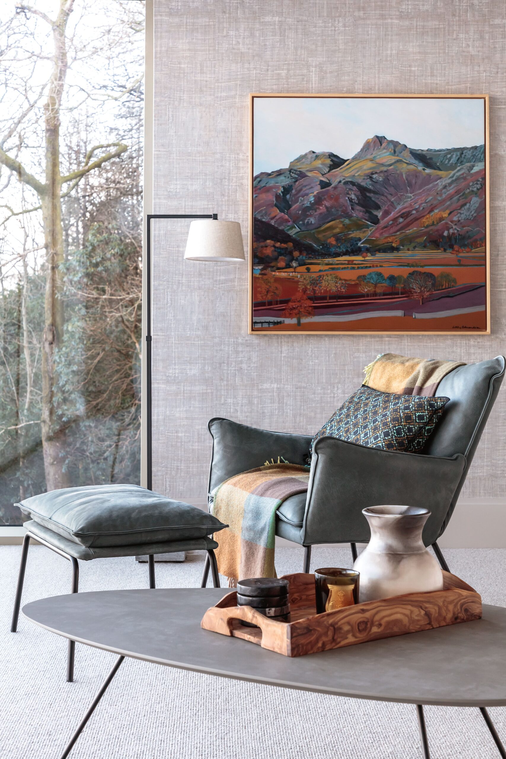
The artwork features some lovely smokey blues that work to blend in with the space, this is a perfect example of choosing an art piece that looks beautiful and eye-catching without it pulling too much focus away from the room.
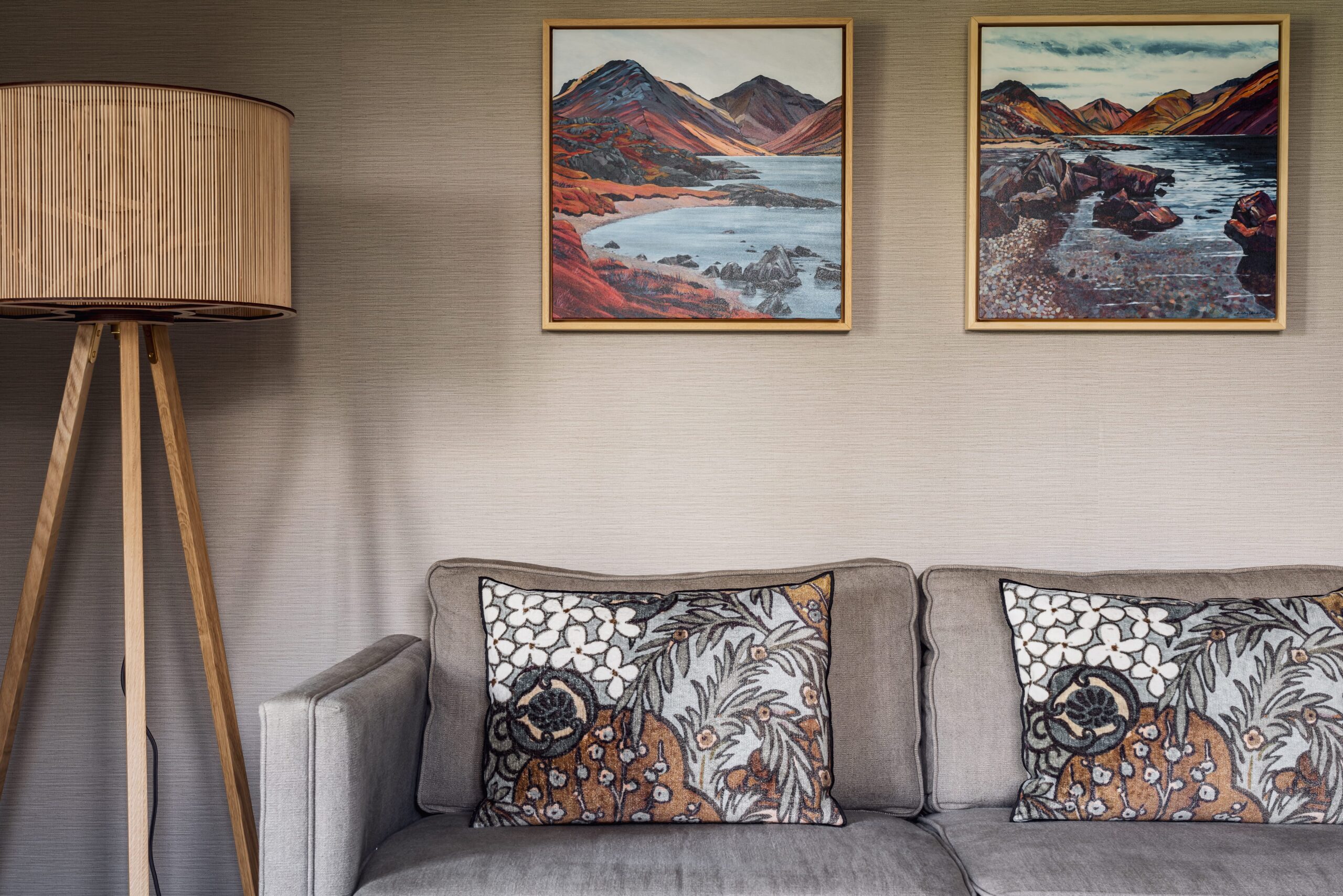
Here’s some more Libby Edmondson pieces that compliment the space. The artwork collaborates with the cushions’ pattern, creating a beautiful colour scheme that all works together to make the area visually appealing and fashions a calm feeling for the room.
A huge reason why we love to support local artists at Nielsen House is because of how beautifully unique the artwork can be. Not only do we appreciate the importance of fine art to complete a room, but we also love that so many local artists take inspiration from the Lake District (just like Nielsen House). It’s a perfect way to bring in the beauty of the location and surroundings into the property.
Bright & Playful Hospitality Schemes
Although our signature brand is very neutral and earthy, our designer love being able to create something a little bit bolder at times. And the perfect place to let creativity flow is when working in hotels and restaurants. More specifically, The Gilpin Spice is a great example of where our designers were able to be a little more playful with colour choice.
The Gilpin Spice was a very adventurous project for our designers. Although we kept our signature style of layering textures, we were able to broaden this to a more global influence for an international market. It was an opportunity to break out of our usual neutral tones and really show what else Nielsen House can offer. Usage of bright reds here are bold and enticing, perfect for building a ‘wow’ factor.

Our designers also mixed in some interesting patterns that add further character to the space. Although the focal colour here is the red, our designers also added in touches of pale blues and muted yellow hues, this helps the red more visually appealing and creates an eye-catching colour scheme.
Hotels and hospitality projects are a fantastic opportunity for Nielsen House to go above and beyond using bolder colours because they need to accompany a luxurious experience and stand out to their guests. Hotels and restaurants want their interior to be extraordinary and stand out against competitors, and what better way to stay ahead of the game than with colour!
Please do have a look at our Projects Portfolio for more of our work